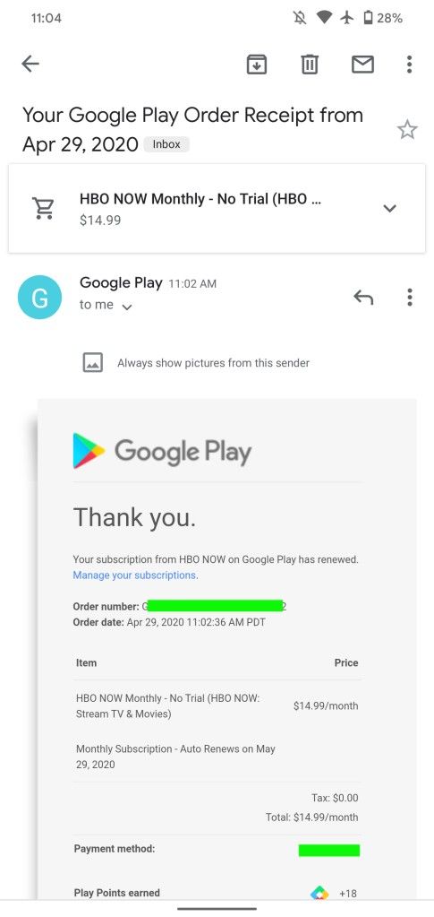
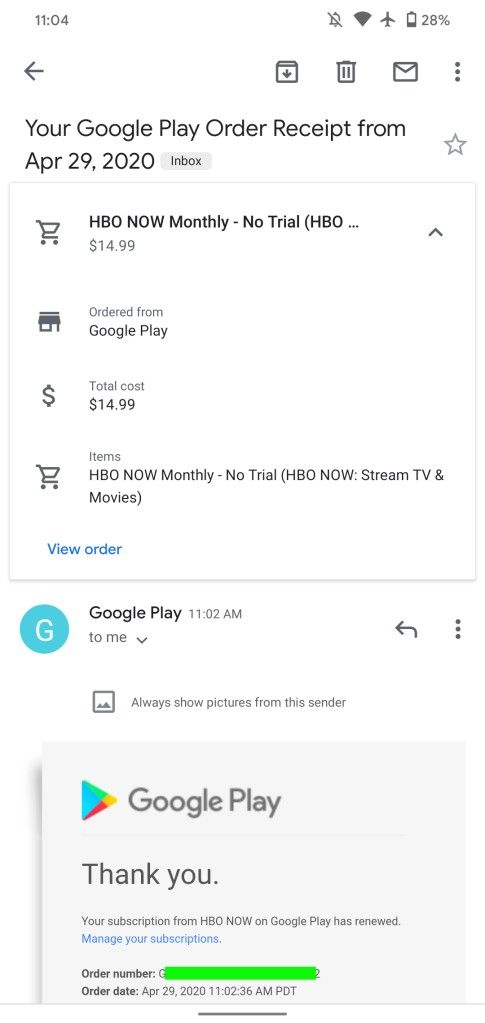
The Gmail app on iOS and Android is getting smarter. According to a recent report from 9to5Google, the app is starting to show summary cards for purchases and travel bookings at the top of emails, a feature that has been available on the web version for quite a while. Now, when you receive an email with purchase details or travel bookings on Gmail, the app will show a card-based UI underneath the subject line.
The UI on the Gmail app for Android highlights important details mentioned in the body of the email including, but not limited to, take-off and landing times, flight duration, passenger name, seat, and confirmation number in case of a flight booking. On the other hand, emails related to purchases will show a similar card with details like “Ordered from,” “Total cost,” and “Items.” However, the purchase summary feature currently only works with transactions made on the Play Store or Google Play transactions, and not for purchases made on Amazon.


At the bottom of the card UI on some cards, Gmail also shows some shortcuts to help users see more details or track a package. The Gmail app on iOS has a slightly different UI, with a cover image and a different card style for the summary. As with the Android app, the full text of the email can be found below the new card UI. The new summary cards make it quite easy to check key details about bookings and transactions at a single glance, without the need to browse through the body of the email.

Development related to the new card-based UI was first spotted back in February this year and it’s finally rolling out to Gmail users on both iOS and Android this week. If you don’t see the Gmail summary cards on your device yet, you can try and update to the latest version of the Gmail app by following the Play Store link below.
The post Gmail for iOS and Android is showing summary cards for purchases and flights appeared first on xda-developers.
from xda-developers https://ift.tt/2KIrd8l
via IFTTT
Aucun commentaire:
Enregistrer un commentaire