Google released Android 11 Beta 2 earlier today, leaving only one more beta to go before a stable release on September 8th. Beta 2 is considered the “Platform Stability” release, meaning the Android 11 SDK, NDK APIs, app-facing surfaces, platform behaviors, as well as restrictions on non-SDK interfaces have been finalized. In their official blog post, Google didn’t mention a single new feature, but that doesn’t mean there aren’t any. Many of the changes we found aren’t obvious, and some of them have even been around since the first Beta release last month. Here’s everything we found so far.
New User-Facing Features and Changes in Android 11 Beta 2
New media player in Quick Settings design is now enabled by default
One of the most welcome changes in Android 11 is the redesigned media player in the notification panel. Instead of residing alongside other notifications, media player notifications can now be shown in their own dedicated space below the Quick Settings panel. In Android 11 Beta 1, you had to toggle a Developer Option called “Media Resumption” to get this new design. Now in Beta 2, this new media player location is enabled by default. The new playback controls also include a button to quickly switch media output between connected devices.
One of the other advantages to Android 11’s new media playback controls is the ability to remember and cycle through 5 previous media sessions. This requires a bit of work from developers to support, but we’ll hopefully see apps like YouTube Music, Pandora, and Spotify get on board soon.
New glowing “ripple” animation in the media player controls
There’s a really cool ripple animation effect when you play/pause media now. pic.twitter.com/JygRQbNVTH
— Mishaal Rahman (@MishaalRahman) July 8, 2020
This is admittedly a rather minor change, but one we thought was neat when we first noticed it. There’s a spiffy new glow/ripple animation when interacting with the buttons in the media playback notification. It’s a small touch, but it looks really nice.
Screen recorder can record device/internal audio and/or microphone at the same time
Android 10 added the AudioPlaybackCapture API to give apps an official way to capture the audio output from other apps. Until Android 10 added this API, most screen recording apps captured audio output from the microphone. Third-party screen recording apps aside, people have been clamoring for Google to add a native screen recorder in Android for years now. That finally arrived in earlier Android 11 releases, but you could only record audio from the microphone. Finally, Beta 2 adds the ability to record device audio, microphone, or both at the same time! This will prove super helpful for making instructional screen recordings or narrating over gameplay. We dug into the code and found that this feature is using the aforementioned AudioPlaybackCaptureAPI, which means it won’t be able to record audio from apps that opt-out.
Less clutter in the Share Sheet


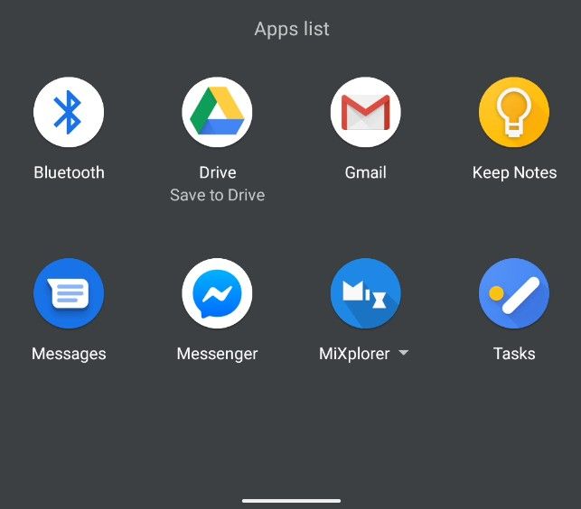
Android’s Share Sheet is one of its most useful features, even though it can be a bit annoying at times. The Share Sheet is populated by a list of apps that have what are called share targets that can handle the kind of content you’re sharing, whether it be text, images, videos, URLs, etc. At the top of the share sheet, you’ll see a preview of the content you’re sharing. Underneath that, you’ll find a row of Sharing Shortcuts that lets you quickly share content with a specific contact followed by another row of any other shortcuts that apps can present as well as any shortcuts you’ve pinned. Lastly, any remaining apps that support the kind of content you’re sharing will be shown in a vertically scrolling “Apps list.”
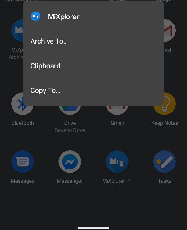
Besides being painfully slow at times, one of the biggest problems with the Share Sheet is how utterly cluttered it can be if you have a bunch of apps installed. Fortunately, Android 11 Beta 2 declutters the share menu a bit by combining any share targets that are from the same app. In the screenshots above, there are 3 share targets from MiXplorer, a free and popular file manager app from our forums. While these 3 share targets are still shown in the Sharing Shortcuts section, they’re all listed under “MiXplorer” in the full “Apps list.” My Pixel 3a XL running Beta 2 doesn’t have a lot of apps installed, but if it did, this small change would really help declutter the share sheet.
…and pinned apps now have an icon indicating they’re pinned
Here’s another simple little change to the share sheet that makes a lot of sense: Apps that are pinned to the top of the share sheet now show an actual pin icon.
Long press on device controls in power menu brings you to the activity
 One of Android 11’s best features is the ability to surface smart home controls in the power menu. This feature, dubbed “Device Controls,” comes with an API that developers of smart home apps can hook into. So far, the Google Home app has already added support, and this week Google has started informing smart home developers to get on board. In case you aren’t aware, you can actually long-press on any of the smart home controls to open up an activity with detailed controls for that specific IoT product without having to open the dedicated app. This is actually one of the key features of Device Controls, but it’s not well known, and we’ve heard conflicting reports about whether it was possible to do in Android 11 Beta 1. Still, if you weren’t aware before, you hopefully are now.
If you don’t have a Google Pixel phone, don’t get your hopes up too much about this feature. After all, there’s no guarantee it’ll show up on all devices running Android 11.
New icon to launch a conversation in a bubble
“Bubbles” is one of Android 11’s highlight features, although it started out as a developer option in Android 10. In the first beta, the Bubbles feature moved out of Developer Options and into Settings > Apps & Notifications > Notifications. The “Allow apps to show bubbles” option is now enabled by default, but apps still need to support showing a conversation as a bubble. So far, only Google’s Messages app and Facebook Messenger support showing chats in bubbles.
Developers adding support for bubble notifications is just one piece of the puzzle, though. Users need to know about this feature, which is why in the last beta, Google added some helpful onboarding information when you launch a chat in a bubble for the first time. Now in Beta 2, there’s a redesigned icon in the notification to pop out a conversation as a bubble. This notification makes it clearer to the user that tapping it will pop the message out of the notification window.
PiP windows have less resizability


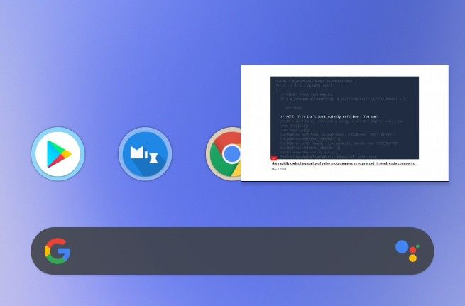
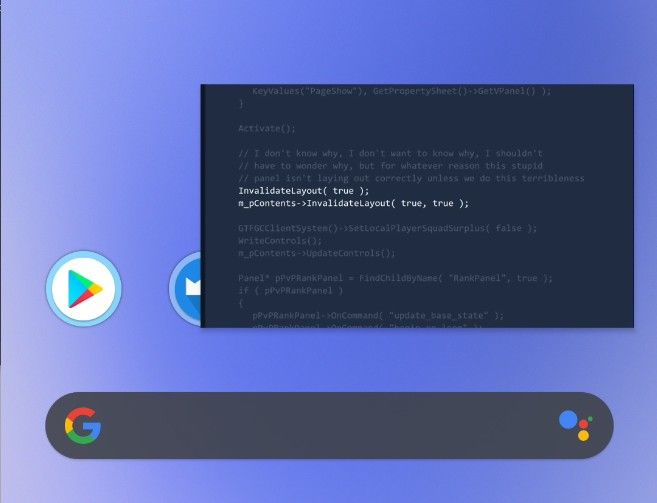
It appears that Picture-in-Picture windows have less flexibility when it comes to resizing, a feature that was just added in Android 11 Developer Preview 4. The screenshots above show the extent to which you can resize the windows. It’s not much, sadly. Earlier releases allowed you to resize the windows so long as the aspect ratio was maintained, but now it appears there’s an upper limit to the window size, likely with respect to the device’s DPI.
New Select button icon in the recent apps overview
Here’s another small little change: the “Select” button in the Recent Apps overview has been redesigned with a new icon. That’s it.
3 more new keylayout files for gaming controllers
We wrote about how Android 11 brings 84 new key mappings for Xbox, Razer, PDP, Mad Catz, and other gaming controllers. Well, Beta 2 adds 3 more to the list: another Xbox 360 Wireless Controller, an Xbox USB Controller, and the Steam Controller (Model 1001). These controllers will now have their buttons properly mapped to key inputs that apps can recognize while connected to an Android device.
Pixel Launcher app drawer has lost its transparency
Seems the Pixel Launcher app drawer has lost its transparency? Video by anoop_V1 on Telegram pic.twitter.com/MTxfRY1BJb
— Mishaal Rahman (@MishaalRahman) July 8, 2020
This change admittedly may have happened in an earlier release, but we didn’t notice it until it was brought to our attention by a tipster. There’s no longer any transparency in the background when you open the app drawer in the Pixel Launcher. We don’t know why this was changed, but we do know that Google is working behind-the-scenes on implementing windows blurs at the compositor level.
Force 90Hz refresh rate option removed, Smooth Display now one less page away
I can confirm both on my Pixel 4 XL. pic.twitter.com/m9SLF3LIP8
— Tylar Overturf
(@TylarOverturf) July 8, 2020
As was first pointed out to us by some Reddit users, the option to “Force 90Hz” refresh rate in the Developer Settings has been removed in Android 11 Beta 2 for the Pixel 4 and Pixel 4 XL. In addition, the “Smooth Display” toggle has been given a more prominent placement in the Display settings. You can see both changes in action in the above tweet.
The removal of the Force 90Hz option has led to some complaints by users, who now report screen flickering issues. These issues likely stem from the display switching between different gamma calibrations when the refresh rate changes. This isn’t noticeable in most conditions, but some users may see it happen when the display and ambient brightnesses are low. Keep in mind that the Pixel 4, like most smartphones with high refresh rate displays, does not support true variable refresh rate switching. Instead, the phone changes between preset display modes.
We don’t know why Google decided to remove this nifty option. Fortunately, if you fiddle with ADB or any app with the WRITE_SETTINGS permission, you can easily force the phone to always run at 90Hz again (set Settings.System.min_refresh_rate and Settings.System.peak_refresh_rate to “90”).
Conversations has a dedicated settings page

In Settings > Apps & Notifications, there’s a dedicated settings fragment for Conversations that’s separate from the other Notifications sub-settings. Here, you can change the settings for any app notification that is recognized as a “Conversation.” You can change the priority, whether the app can show as a bubble, and more.
Slight tweak to the markup screenshot editor

via @hardikpakhale
Pixel phones come with a basic screenshot edit called Markup. In Android 11, the top row of icons has been changed. The “Share” button has been replaced by a share icon, the “save” button has been moved to a new dialog that appears when you tap “Done” (which was previously just a back arrow to exit Markup), and there’s now a trashcan icon to delete the image. When you tap “Done,” there’s also now a Delete option in case you change your mind.
New “Allow screen overlays on Settings” Developer Option
There’s a new option in Developer Options is called “Allow screen overlays on Settings.” Enabling this will allow apps with the “display over other apps” permission to show their floating windows on top of Settings screens. We aren’t entirely sure why this toggle has been added considering that Google plans to do away with overlays in favor of the Bubbles API. It’s possible that Google wants to make screen readers and other Accessibility services that use overlays to be able to help users navigate Settings.
Bubbles neatly hide when an app goes full screen
Viewing something in full screen while a bubble is on the screen now smoothly hides the bubble. pic.twitter.com/MekFDaJ9jC
— Cyan
(@AnalogCyan) July 8, 2020
According to tipster @AnalogCyan, the floating bubble icon in Android 11 now hides when you launch an app goes full screen.
From Beta 1: Disable Wi-Fi Auto-connect for specific networks

Android has supported automatically turning on Wi-Fi and connecting to nearby (trusted) networks, but this has always been an all-or-nothing thing for Pixel phones. You either enabled the “Turn on Wi-Fi automatically” setting in Settings > Network & Internet > Wi-Fi > Wi-Fi preferences or you didn’t. In the first Android 11 beta, Google added the option to toggle this feature on a per-Wi-Fi-network basis. Simply go to “Network” details for any saved Wi-Fi network and then toggle “auto-connect.”
From Beta 1: Save Images from the Recent Apps Overview


The Device Personalization Services app on Pixel phones adds a nifty feature to the recent apps overview: the ability to long-press text or images to open the context menu. In an earlier Android 11 beta, Google added the ability to “save” an image you long-press in the recent apps overview.
In-Development Features in Android 11 Beta 2
New Pixel Launcher developer option to separate the recents activity from the launcher
In Pixel Launcher’s hidden developer settings, we spotted a new option that is sure to excite modders out there. In Android 9 Pie, Google moved the code for the recent apps overview from SystemUI to Launcher3, which is the AOSP launcher app. From Android 9 Pie to Android 11, the recent apps overview has been a part of the stock launcher, no matter whether that’s the Pixel Launcher on Google Pixel devices or the OEM launcher app of non-Google devices. The benefit of this change is that gesture navigation integrates seamlessly with the recent apps overview. However, this move has left third-party launcher developers in the dust since gesture navigation is either broken or incredibly wonky if the user isn’t using the stock launcher. This new option in Pixel Launcher could hint at a possible separation between the recent apps overview and the launcher UI, but we don’t know exactly how it will be implemented. We’ll be keeping an eye out for more clues, though.
Suspended execution for cached apps
Google is working on a new Developer Option aptly code-named “cached apps freezer.” According to a few strings we dug up, this feature will “suspend execution for cached apps.” Users can toggle this feature on a per-app basis.
<string name="cached_apps_freezer">Suspend execution for cached apps</string>
<string name="cached_apps_freezer_device_default">Device default</string>
<string name="cached_apps_freezer_disabled">Disabled</string>
<string name="cached_apps_freezer_enabled">Enabled</string>
<string name="cached_apps_freezer_reboot_dialog_text">Your device must be rebooted for this change to apply. Reboot now or cancel.</string>
We haven’t been able to surface this feature yet, but we’ll update with a few screenshots once we get it working.
Device Drop Monitor
It’s no surprise that Google is working on new Pixel phones, though who knows when they’ll see the light of day. It seems, at least, that Google is still actively collecting data from users to improve their future devices. Android 11 Beta 2 on the Pixel 4 and Pixel 4 XL has a new pre-installed app called “Device Drop Monitor.” You won’t find it in the app drawer, though. This app detects when the device has quickly dropped to the ground. It logs the duration of the freefall and the device’s acceleration. When a fall is detected, the app shows a notification asking the user to complete a brief survey. The survey asks the user to estimate how far the device fell, what material the phone landed on (concrete/asphalt/hardwood/carpet/tile/etc.), and whether the phone was in a protective case. After completing the survey, the app will tell users that their “input will help improve the design on future Pixel devices.” We don’t know if this app will ever show surveys to regular users, though, since it looks like the code to initiate a survey is hardcoded to return false.
High Brightness Mode Manager
In response to user complaints that the Pixel 4’s display is too dim to see outdoors, Google updated the Adaptive Brightness algorithm to enable High Brightness Mode when extremely bright ambient lighting has been detected. It seems that Google is moving to push this code to AOSP, though, as we spotted a new system application called HbmSvManager with the package name com.android.hbmsvmanager that contains the logic for this algorithm.
As always, if we learn more about Android 11, we’ll post an article on XDA. You can follow our Android 11 tag to keep up with everything we find:
The post Android 11 Beta 2 – All the new and in-development features we found appeared first on xda-developers.
from xda-developers https://ift.tt/3fj9bHu
via IFTTT


Aucun commentaire:
Enregistrer un commentaire